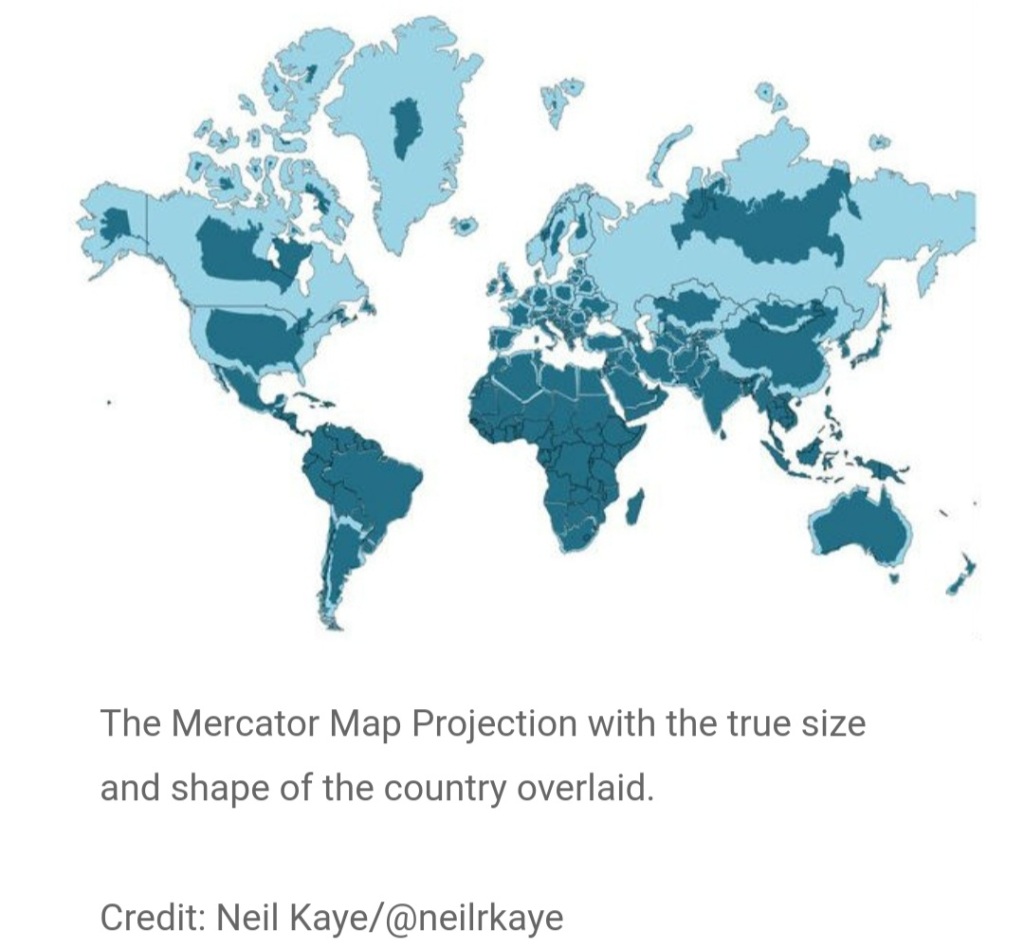
This Nature article illustrates the distortion to our perception of the world introduced by the map most of us are familiar with.
The world map we know makes objects closer to the poles appear larger so Greenland looks the same size as Africa which is 14x bigger.
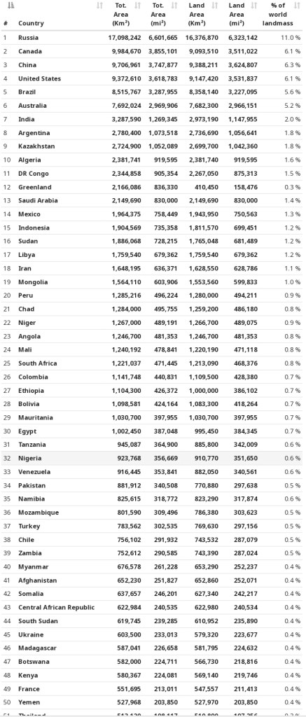
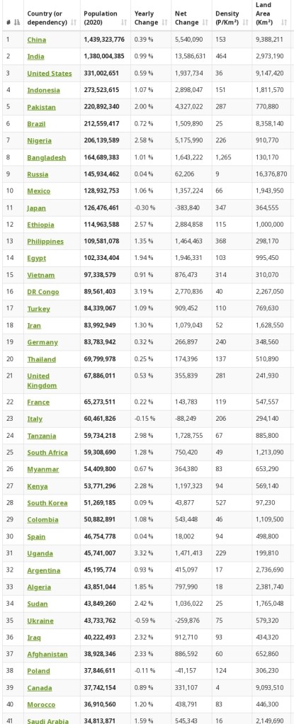
The 6 largest countries by size are Russia, Canada, China, the US, Brazil and Australia.
Both these maps put the UK at the centre of the world for historical reasons. The links below provide further perspectives and details.
https://en.m.wikipedia.org/wiki/List_of_countries_and_dependencies_by_area
https://www.worldometers.info/world-population/population-by-country/
https://www.worldometers.info/geography/largest-countries-in-the-world/