I recently had a baffling experience in Google Colab where the number of records in a dataframe appearing with a non-null value for a particular field (“Outcome”) suddenly dropped.
I checked the raw source data in Excel and, filtering on the “Outcome” column, the number of Excel ‘blanks’ was lower than the number of records showing null for “Outcome” in the dataframe.
Trawling through the specific records that showed a null in the dataframe, it turned out that some of these were in fact not blank in Excel but rather the actual string “None”.
This had always been the case but somehow suddenly these “None” cell values were being converted to Python nulls (confusingly, these are displayed as ‘None’ or ‘NaN’ in Colab) in the dataframe records.
The dataframe was loaded from Excel using the pandas.read_excel method.
So how do we get “None” strings to appear as “None” strings in the dataframe rather than Python ‘None’ nulls?
It turns out that by default the read_excel method changes certain Excel values to null as per its default na_values parameter.
To get the “None” values read in as “None” rather than null one has to specify keep_na_values as False; if we want empty strings to still be read in as nulls, however, we also need to tell the method this by setting na_values to “” (an empty string) e.g.
This and further subtleties (e.g. Excel displaying in its user interface a value different to what is in fact stored) is described in this Stackoverflow post.
In summary, another unexpected change in Google Colab Python code behaviour. With the help of the API documentation we can explain and work around it, though why the behaviour suddenly changed (previously ‘None’ strings in Excel were read into dataframes as the same, rather than converted to nulls) I have no idea!
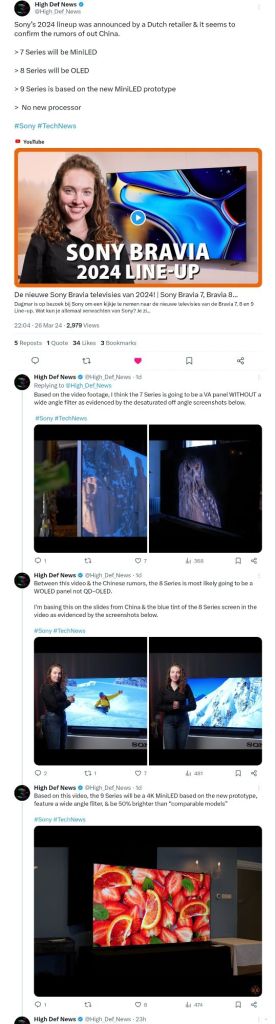
A Dutch Retailer, Expert Nederland, has stolen a march on the tech TV reviewers and shocked the TV review world by releasing technical details of the new-for-2024 Sony Bravia TV models.
It looks like there has been some controversy around this decision however, with their video getting taken down a few hours later in mysterious circumstances.
You can check out the High Def News Twitter (X) post for details.
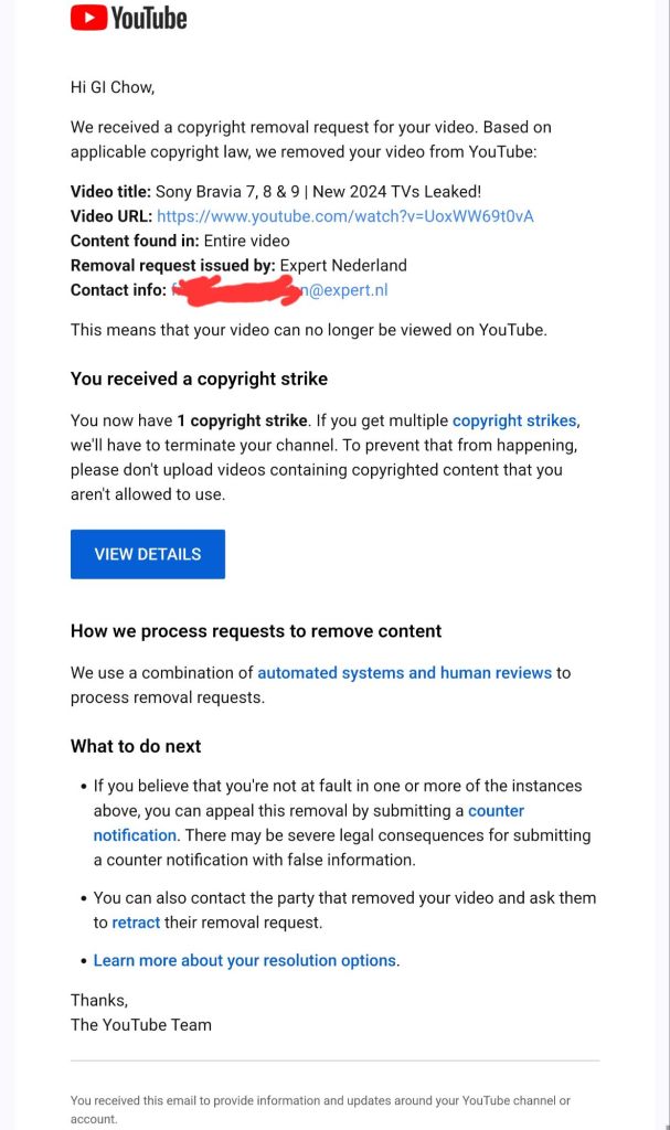
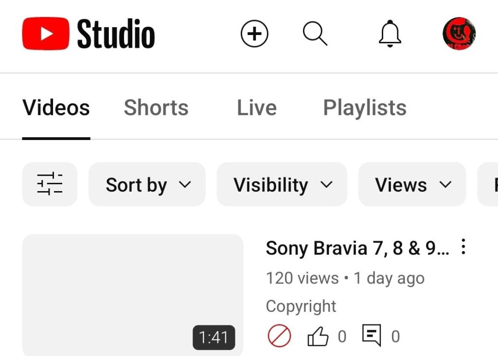
I created a short video summarising the main technical features and including (credited) footage of the feature-explainer graphics, with screenshots of the High Def News post, however almost immediately got served with this notice by YouTube:
In my book, my video fell under the doctrine of fair use and YouTube provides some guidelines:
1) the content in the materials employed in the video was substantially transformed with educational / review / news commentary
2) the video is nonprofit
3) the video uses material from factual works and is akin to news reporting
4) the video gives credit for the materials used in the video with redirection to the original content in the video description
5) the video used no sound from the original video or footage of the actors. In fact, ironically enough, the original video itself included footage from a Scarlett Johansson movie – presumably to illustrate the “filmmaker intent” and “includes Sony Pictures expertise” message.
Regardless of arguments about whether it was or wasn’t fair use, I’d have happily had a conversation with the original content creator about what they objected to.
The strike came before any such discussion could be had. My video was up for all of 8 hours before being taken down.
Sony Bravia 7, 8, 9 – nothing to see here!
Typically, content like mine is good for the original content creator with redirection to their video and good for the manufacturer – there’s no such thing as bad publicity right? And, of course, good for us consumers – informing the very people spending their hard-earned dosh!
So, what follows is the original script for my taken down video:
A Dutch Retailer Expert Nederland has stolen a march on the tech TV reviewers and shocked the TV review world by releasing technical details of the new–for-2024 Sony Bravia TV models.
Here’s what they’ve said, together with some speculation from High Def News (myvideo included screenshots of the High Def News X post referred to above).
The Sony bravia 7 will be a mini led with much smaller leds for precise image control in 65, 75 and 85 inch sizes.
The XR back-light master drive minimises blooming effects and Zoom 3 audio improves voice intelligibility in scenes with background noise.
The Bravia 8 uses OLED technology, like last year’s flagship A95L and comes in 55, 65 and 77 inch sizes with a contrast booster and panel temperature monitor to reduce the risk of screen burn. With acoustic surface plus audio, sound is created by vibrating the screen for more accurate sound positioning plus a sub and tweeters provide for a more natural response.
Sony’s top TV model for 2024 is the Bravia 9 which abandons oled and uses mini led with even more dimming zones. It’s a claimed 50% brighter, coming in 75 and 85 inch sizes. X-wide-angle and X-anti-reflection technologies improve viewing angles off centre while acoustic multi audio plus upgrades sound and surround effects further.
All 2024 Sony Bravia models have the XR processor at their heart, now in its 4th generation and use Sony Pictures Entertainment expertise to focus on the things us humans perceive, so prioritising the main characters on screen over the background, for example. There’s also a new “Calibrated” mode which removes image processing so you see closer to what the filmmaker intended.
So, do any of these features convince you to get a new Sony Bravia in 2024?
If you got value please subscribe!
So, there you have it! Hope it helps, and yeah if you got value.. you know what to do 😉
Update 23/4 Expert.NL kindly removed the copyright strike against my channnel and asked that I remove the video from live.
Surprisingly this was not on the Depop YouTube channel so thanks to Shazam for finding it.
The music has a somewhat sinister but catchy Electronic Dance Music feel with ethnic instrument sounds and lyrics in a non-English language (with English words like ‘supersonic’ and ‘peace out’) that I presume is Hindi or a dialect given the artist is from Mumbai.
The throat clearing near the start gives a live or less highly produced fresh feel and the musical scale conveys an edginess to the brand, which is in the ‘circular’ recycled fashion sector, and invites a more diverse audience than some of its competitors.
This tutorial is now available as a thirty second short video with frame-by-frame analysis of how the left and right foot moves to achieve the levitation effect.
The video shows how attention is drawn to the leading front foot which appears to hover in the air and how the trailing back foot is the one that in fact does the work to maintain the highly effective illusion of walking on air.
Since October 2023, TikTok users have been captivated by the dance video posted by Korean student Lee Hyo-cheol, where he seemingly glides magically off the ground.
The so-called Slickback dance move, named after the song “A Pimp Named Slickback” it is set to, now has several videos devoted to it racking up over 2 billion views.
Lee moves in a way that makes it seem like he is able to step so hard on the air that he can get purchase on it and float above the ground.
Lee modified a dance move created by YouTuber and TikTokker Jubi2fye in early 2022. The “Jubi Slide”, as it is known, looks somewhat like a sideways moonwalk.
The new move focuses more on the striking out of the heels than the sliding, “moonwalk” movement and traverses some distance on the ground rather than being confined to a single spot.
Links to Lee’s original TikTok @wm87.4 account video and a “tutorial” by @gkocoach are available at:
A fundamental concept is attention i.e. the adding of context and meaning to individual words by considering each individual word against each of the other words surrounding it.
For example, if a sentence contains the word ‘bank’ then the presence of ‘money’ in the same sentence suggests that means a financial institution rather than a river bank.
Attention is implemented in code using query (q), key (k) and value (v) vectors and there are some analogies like this one, which regards the key/value/query concept as similar to retrieval systems. For example, “when you search for videos on Youtube, the search engine will map your query (text in the search bar) against a set of keys (video title, description, etc.) associated with candidate videos in their database, then present you the best matched videos (values).”
This analogy raises as many questions as it answers however
What is the query? – the whole of the text we provide to the AI interface (ChatGPT, Bard, etc) or just a single word?
How is the query stored in a matrix?
What kind of key is the query matched against?
How does the key relate to the value?
Is the value something we get as an output from the process or something the model already possesses from previous training?
What is the point of the value we get from this whole process? How does it relate to generating a response to the text we enter into things like ChatGPT or Bard?
To answer these questions, I found this video which provides a great practical explanation of the model that is simultaneously proven as demonstrably correct through being implemented as working code with a small scale test case that can be trained and run in minutes on the free Google Colab platform.
Karparthy (1:04:15, 1:08:00) describes the query (q) as “what am I looking for” (“I” being a single token from the input sentence) and the key (k) as “what do I contain” so the dot product q.k (where k is all the keys of all the tokens in the input sentence) becomes the affinity between the tokens of the input. Where a token’s query vector aligns with the key vector of another token, the token ‘learns’ more about it (aggregates its feature information into its position).
The value (v) is the “thing that gets aggregated for the purpose of the particular head of attention” that the q, k and v matrices form. Ultimately, the purpose of value is to appropriately weight the token affinities (q.k) so that the product q.k.v is able to sufficiently distinguish token sequences and hence allow the most appropriate next word to be predicted (by the very last ‘softmax’ component of the decoder).
To put all this into more pithy and understandable terms:
There is a query, a key and a value matrix for each ‘head’ of attention, i.e. way of characterising the relationship between words (e.g. relations between tokens, relations between pairs of tokens, relations between groups of 4 tokens, etc.)
Q contains the ‘word mix’ (more accurately token mix) from our input text (a) at a particular word position in the text and (b) constrained to a fixed number (e.g. 4, as “hard-coded” for our particular LLM implementation) of sequential words e.g. 4 words from our input text “I like learning about artificial intelligence” at position 1 would be “I like learning about”.
K contains the features that this same set of words has – one feature might be e.g. “is a doing word”
Q.K gives us a representation of the meaning of the input word mix by aggregating the features each input word has (K) against the features each input word is looking for (Q). So “I” might look for the “doing word” feature and “like” and “learning” would offer that feature. In the matrix dot product for the “doing” feature, “I”, “like” and “learning” would shine. This product is also called the compatibility matrix since it captures how compatible each word is with every other word and hence the extent to which the features of the compatible words should be baked into each query word.
We need a consistent way of storing meaning for the computer since two different human language sentences or ‘word mixes’ could yield the same deep meaning (e.g. “a likes b” and “b is liked by a”) and vice versa i.e. two identical sentences could give a different deep meaning depending on what words came before them. Q.K gives us that.
V contains the values or weights for each word’s features e.g. we can imagine features like
is an action
is a thing
When V is then multiplied by Q.K we get a numeric matrix that we can use to represent the meaning of the word mix. Subsequent steps in the model can then predict (from the model’s historic training data of English sentences / knowledge) which word likely comes next after encountering this particular meaning.
Hope this helps – if you find a better explanation or ‘intuition’ of qkv please do leave a comment!
If you’ve listened to the Mark Kermode and Simon Mayo podcast or watch their YouTube channel you’ll already know which of their opinions is the best barometer of your own.
I enjoy watching their discussions about movies but sometimes wish I could quickly jump to their main conclusions about a film to see whether it might be for me and hence watching their full review worthwhile without ploughing through the whole episode.
I used Google Bard’s recent YouTube video summarisation skill to try to get exactly this and you can see its results in this ultra short 54 second video.
If it peaked your interest check out the full Kermode and Mayo video – and see how good a job Bard did.
Or check out their podcasts (requires a subscription)
This blog is now available as a 59 second short video.
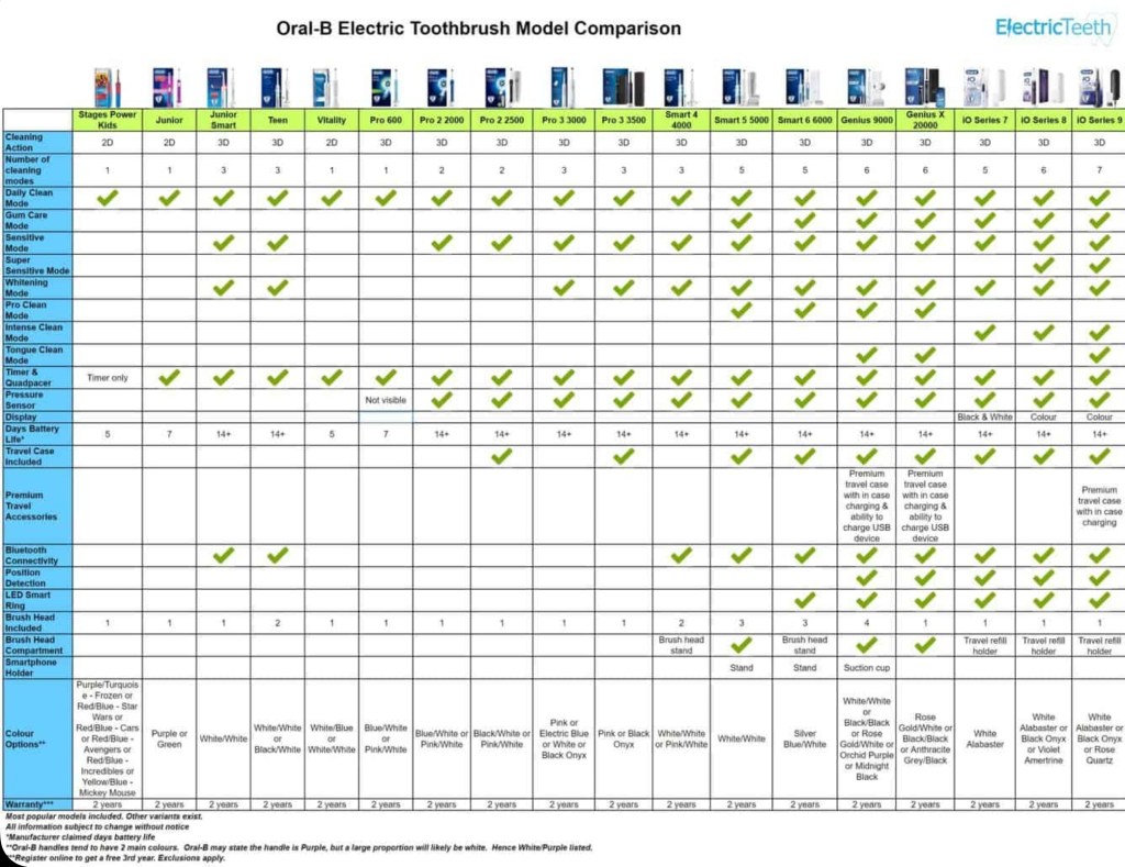
If your old toothbrush has seen better days but you’re confused about which Oral B model and brushing mode offers the best tooth cleaning and value for money, you’re not alone.
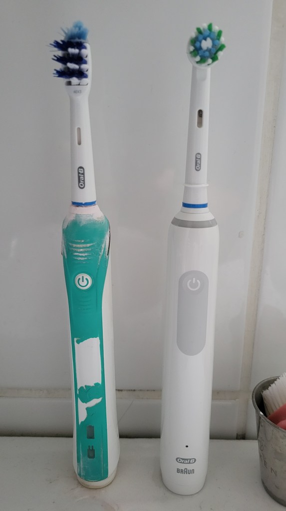
My old Braun Oral-B TriZone electric toothbrush – type 3756 shown on baseStill working after 10 years but battery only lasts 2-3 days
There are 3 things to consider – model, mode and brushes.
The Oral B Pro 3 and iO models are popular choices but what’s the difference and does the more expensive iO clean better?
Well the Pro 3 3500 is the same as the 3000 but includes a travel case and only comes in pink and black. The iO range has a magnetic motor which is quieter but its heads are over twice the price, not proven to clean better than the Pro 3 and not compatible with the heads of earlier Oral-B models.
The Pro 3 and iO both have the “3d Action” of oscillate (move back and forth), rotate and pulsate (vibrate against the tooth) but also a “Whitening” mode which varies oscillation speed up and down for deeper cleaning. There are further modes however all Pro3 and iO models also have “Daily Clean” and “Sensitive” modes and these 3 modes are sufficient for most people.
Finally onto heads. CrossAction heads have angled bristles for better cleaning though may be less comfortable than the basic Precision heads and the Floss Action head has micro pulse bristles for better interdental cleaning though doesn’t replace flossing. Some prefer the Deep sweep or trizone head which is shaped more like a manual toothbrush.
Old Oral-B Pro 2 2000 (Trizone head) v new Pro 3 3000 (CrossAction head)
Diagrams and details are available at electricteeth.com, animated-teeth.com and oralb.com:
This blog post is available in the YouTube short form if you’d rather hear it in 59 seconds.
If you were moved to tears by the 2023 John Lewis Christmas commercial “Snapper, the perfect tree” there are 6 hidden and not so obvious reasons the copywriters were able to tug so hard on your heartstrings.
The retailer has produced some of the most iconic Christmas ads of this century employing themes of friendship, generosity, tolerance, sharing and imagination but this sophisticated ad manages to cleverly combine all of these.
In a household with no obvious male influence the boy, like Elliott in Spielberg’s ET, is both nurtured by and nurturer, growing to understand fatherhood by becoming the protector and friend of this lonely and ostracised alien creature.
John Lewis Christmas commercials often uses cover versions of well known pieces to shift perspectives on the familiar and Andrea Bocelli’s new piece Festa uses theatrical repetition of the lyrics “la vita è una festa” – meaning “life is a celebration” – to provide an inspiring composition.
The retailer’s theme this year is the fusion of old and new festive traditions with the Saatchi strapline ‘Let Your Traditions Grow’, celebrating evolving and multicultural customs, finding joy with loved ones, whatever your traditions.
The plant is born helpless and needy but becomes an inspiration. This echoes the Christian nativity story. And the boy’s innocent recognition of goodness in the unusual is uncoloured by prejudice or preconceptions.
Popular opinion is mixed with right wing media commentary focusing on the lack of tradition and woke agendas but more liberal sources on the heartwarming celebration of difference – you can see below how different the comments are against the YouTube videos released by The Guardian and GBNews.
At a time when the UK has become more intolerant of strangers and difference than ever, with nationalism and exceptionalism having taken centre stage this seems like the perfect antidote and glimmer of hope of a welcome return to the sanity of the politically liberal mutual understanding and acceptance – like that of a boy and a carnivorous plant.
The best ads resonate, inspire and stay with us. I feel this one just might.
Transferring 10,000 photos from Windows to Android
Having recently upgraded to a new phone (Samsung S21 FE 5G 128GB) I wanted to transfer around 10,000 photos (30 GB) from my old phone to it.
My old phone had completely died and wouldn’t even turn on but my photos were happily safe on a micro SD card – a removable storage medium that the latest Samsung S series premium phones unfortunately no longer support.
I put the micro SD card into a a full size SD card adapter and then into a SD card reader which I plugged into my laptop’s USB 3 port and could see the photos on the card.
At the same time I plugged my new phone, via a USB C to USB A cable, into the laptop and could see the phone’s internal storage, where I had previously created a new folder (using the phone’s Files app) to transfer the files into.
As an aside, I created that new folder from the phone itself rather than from Windows File Explorer since when doing it the other way round I couldn’t see the newly created directory from the phone!
Unfortunately, when selecting the files in Windows (I sorted them in Windows File Explorer by file type and then picked just .jpg rather than the even more space hungry video files) and copy pasting them over to the Android folder the transfer was taking forever! The estimated time started at 2 hours and increased to over 6 hours.
It took so long that the connection to the phone dropped and the copy only got part way through, meaning I had to see how far through the copy had got, select the remaining files on my laptop and start the copy process again.
I did this a few times over a couple of hours before deciding to search for another more reliable approach!
There are numerous reports on forums and Q&A sites of this issue, like
with either no solution or just a suggestion that the slowness is due to limitations of the USB port or USB cable or file storage device or the file transfer protocol.
Files, typically 1 to 3 MB in size, were taking around 3 seconds each to copy over so transfer speed was around 40MB per minute or 2 GB per hour, far below the theoretical speed of the USB port and cable – even for USB 2 this is 70 GB per hour (and 4x that for USB 3).
With 30 GB of files, we were looking at around 15 hours! ..and that’s without the connection to the phone being lost, which was happening consistently around an hour into copying and therefore requiring my manual monitoring.
I noticed that some much larger 30 MB panoramic photo files were taking not much longer to copy than the much smaller typical 2 MB photo files, indicating a potential throughput of 10MB per second (600MB per minute) which was much more like it!
This confirmed that my USB cable’s throughput, which I was beginning to suspect (even though I had previously copied files the other way round, from my old phone to laptop, in reasonable time frames) was not the limiting factor, but rather something was happening that was related to the sheer number of files.
Maybe each file was being virus scanned by the phone or the file allocation table in the phone or indexing or integrity checking was the bottleneck but, whatever the reason, transferring via a zip file seemed a potential solution to reduce the number of individual files needing to be copied to the phone.
As it turned out zipping the files and transferring the zip file turned out to be exponentially faster – though there were a few gotchas!
Zipping around 1000 files into a 5 GB zip file took 10 minutes (it would have been much faster had I not run several zips of photos from different years at the same time) and then it took just 5 minutes to transfer the zip to the phone against the hour plus it would have taken to transfer them as as individual files.
So the last hurdle was unzipping them on the phone.
I tried the “Files By Google” app however this gave a disheartening error when trying to extract the files from the zip, making me think all was lost.
I googled the failure and came across the ZArchiver Android app which happily came to the rescue and was quickly and successfully able to extract all the files from the zip in around a minute.
So, say 15 minutes in total to zip, transfer and unzip 1000 files rather than the hour it was previously taking, a 4x speed increase in transferring multiple small files!
In fact I copied over the remaining 20 GB of files I had left to transfer in around half an hour rather than the 10 hours it would have taken so a 20x transfer speed increase.
Other options for transferring files from PC to phone include wireless ones like
uploading to a Cloud file storage service like Google Drive or OneDrive – if you don’t have enough storage free you can upload in batches
using file sharing apps like Google’s own Nearby Share – which uses WiFi and Bluetooth but requires installing and configuring software.
Yes, they were a bedrock metric that you based your KPIs on but they are no longer.
In UA (GA3) Google told us “unique pageview, as seen in the Content Overview report, aggregates pageviews that are generated by the same user during the same session. A unique pageview represents the number of sessions during which that page was viewed one or more times.”
In GA4 Google tells us simply there is no GA4 equivalent of the GA3 (UA) Unique Pageview, helpfully putting a ‘N/A’ in the GA4 column of the UA to GA4 mapping table, without so much as a by your leave.
So what metric do you use to see which pages get the most individuals looking at them?
Well looks like there is a ‘Users’ figure against pages which Google explains is “The number of distinct users who visited your website or app.”
I’ve found this new GA4 ‘users’ metric to show a significantly lower figure than the old UA ‘unique pageviews’ (UPV) figure, which may be because the latter was counting every user session where the page was viewed rather than just the unique users behind those sessions.
Who knows?
You can go to the Explore section on the left hand side of the GA4 menu and hand craft your own report of ‘sessions’ against pages but I found that yielded a figure similar to ‘users’ and markedly lower than the UPV figure I’d recorded for previous months.
Some will tell you there is a way to get those old UPV figures by combining user and session data using BigQuery. Easy huh?!
Erm, no. It’s gotten hard to get a UPV figure. But is that because Google wants you to spend time and money doing your own analysis of the data about your website they go to considerable lengths to collect and present? Or because it’s a dated concept they’d rather you didn’t use anymore?
My simple take is that at the end of the day, Google captures certain information during website page (and now app screen too) interactions and tries to present this to us in digestible, useable and familiar terms – so, for example, a user isn’t really a user in the sense of an individual person, it’s some recorded activity of pages being visited by a browser, storing a cookie on the device hosting it, within a certain amount of time since the last visiting of pages by that same browser.
Now as Google gets better at identifying real life actual users (e.g. through verified sign-ins to your own site, or even Google accounts) you may see an apparent decrease in users of your website, when in reality you are just seeing the consequence of Google Analytics more accurately counting users.
This is the quandary of data quality. Improving our data quality may mean we look like we’re doing worse in terms of the amount of data we’re collecting. So why try harder to improve data quality? I mean never mind the quality, feel the width. Unless that quality can ultimately lead you to better decisions..
Well, musings aside, I’m going with dropping UPV from my metrics in favour of the easier to report on users figure for now – but if you have a better understanding leave a comment and enlighten us all!